Artworks
Faculty of Economics
Description
Quite probably, the De Mora Hospital would never have been built had it not been for the existence of a longstanding tradition of teaching in the field of Medicine in the city of Cádiz. Under the auspices of benefactor José Moreno de la Mora y Vitón, the Provincial Hospital was built on a plot formerly belonging to the Military, close to the La Caleta area.
To achieve his goal, the eminent benefactor commissioned the French architect Lucient Viraut, who envisaged a building made of reinforced concrete, with a symmetrical pentagonal ground-plan as a small-scale urban project.
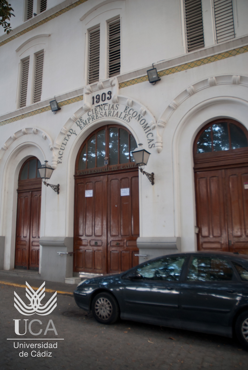
It comprises a series of blocks linked by courtyards and thoroughfares, divided into two parts. In the first of these, the west-facing façade consists of a triangular ground-plan comprising a basement, three floors and two lower level volumes at each side. The façade has a chamfered front that serves as the main entrance to the building, incorporating three large half-point arches inscribed with the year the Faculty was founded, 1903, and its name: “Faculty of Economics and Business Studies”. The original inscription, in honour of Saint Joseph, the Hospital´s patron saint, was replaced in 1910 with the inscription “De Mora Hospital”. This building, which is positioned along a symmetrical axis, with an internal road which runs along the front of the building and where the main entrance is located, houses the hospital´s ancillary services on its two lower floors. Its upper floor is reserved for the Director and the nuns.
The façade has a pronounced horizontality, accentuated by thick mouldings decorated with tiles, and has five double-rows of rectangular windows with trim. Finished in white, the façade features a grey stone baseboard trim and is topped with a gabled flat roof.
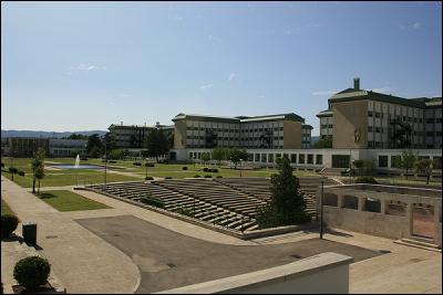
A second section of façade, which crosses the entrance axis, has a commanding position on the internal thoroughfare as well as acting as a centrepiece amid the other buildings. It features two porticoed galleries with half-pointed triple galleries glass enclosed by glass at both ends. In the centre of this second section of façade, on the same axis as the main access, is the church. Here there are four three-storey hospital buildings with rectangular ground-plans, two on each side of the church, which also enclose three large courtyards. All these elements are linked by a corridor that runs across the rear façade of the building, serving the different axes.
Five staircases originally provided access to the floors: four at the far edges of the blocks next to the arcades, and a fifth staircase that was located centrally, on the main axis annexed to the back access corridor, which was subsequently removed. Four new staircases which were added as part the last programme of works to convert the site into a university centre are located at the far end of the blocks.
The project was conceived with the principal aim of meeting the hygienic specifications of the institution: elongated blocks with good natural light and spacious open-air zones where patients could convalesce. This environment, with its white finish, enhances the clean appearance of both the main façade and the second hub of buildings, which maintain the same decorative features, thus achieving the same formal appearance.
The church, which is detached and has a Latin cross ground-plan and a single nave with an inconspicuous crossing, is the centrepiece of the complex. This is a distinctive building inspired by the neo-Gothic and neo-Mudéjar styles, with three entrances – a main entrance and two side entrances. The main entrance is preceded by a two-flight staircase with a marble balustrade, which is the same material that is used on the entrance hall. There, it is distinguished by a half-point framed arch with latticed voussoir, which, with its intrados, creates a horseshoe arch flanked by pairs of Corinthian columns and corrugated pilasters. These are capped with a half-point tiled arch containing a cluster of three tall stained glass windows, above which is a triangular form comprising three belfries. The formal style is perfected by a display of imaginative and eclectic elements: lancet windows on the sides, a pair of ambulatories around the apse and the use of angle buttresses and finials.
Although the most recent intervention brought about a redistribution of space in line with the new academic purpose that the complex now serves, its formality remains.
Details
- Title: Faculty of Economics
- Category: Building
- University: University of Cádiz
- Authors: Anonymous Author


 EN
EN  ES
ES 


